

Steve Champion and Derek Featherstone initially used the term “progressive enhancement” in 2003. According to Champion and Featherstone, Progressive enhancement is “an approach to web development that emphasizes core web technologies, content, and accessibility from the start, then adds more advanced, optional technologies using a layered approach as the browser and user capabilities are enhanced.”
Progressive enhancement is a methodology for creating websites and web applications that prioritize delivering fundamental capabilities and information to users before adding more sophisticated features for those with more advanced browsers.
Progressive improvement has several advantages. To begin with, it guarantees that regardless of browser or device, all users will be able to access your website’s essential information and features. Additionally, it makes your website more resistant to technological changes because the crucial information and features will always be available even if a particular browser does not support newer, more sophisticated technologies.
Since it enables you to add new features and functionality as necessary without having to redo or re-architect the entire site, progressive enhancement is also a more adaptable and modular approach to web development.
One of its best features is progressive enhancement results in more stable and resilient websites. You may ensure that your site will remain accessible and usable even if newer technologies malfunction or are not supported by a particular browser by starting with the fundamentals and gradually adding more sophisticated capabilities.
Several excellent resources are available if you’re interested in learning more about progressive improvement, including the original essay by Champion and Featherstone and this more recent article by Scott Jehl.
Recognizing the Progressive Enhancement Core Principles
The creation of websites and web applications can be done in various methods. While some programmers like to start from scratch utilizing the most recent technology, others choose a more “progressive enhancement” strategy.
Progressive enhancement is about creating websites and applications with a strong foundation for all users, irrespective of their browser or device. With this strategy, an essential, helpful website or application is built first, and then extra features and refinements are added for users with more advanced browsers or hardware.
Making sure that your material is accessible to everyone is one of the main benefits of progressive enhancement. You can be confident that visitors using outdated browsers or devices can still view your content by starting with a simple, functional website.
Making your website or application more resistant to technological changes is another benefit of progressive enhancement. The most recent features of your website will still function even if a new browser or device is released that doesn’t support them.
Progressive enhancement can be applied in a variety of ways. Sometimes, start with an empty page and add content and functionality when the user’s browser or device permits. Other times, launching a fully functional website or program could be more sensible before removing features incompatible with older browsers or devices.
The most important thing to remember is that progressive enhancement aims to give all users a stable foundation, regardless of their browser or device. You can guarantee that everyone will have access to your content by starting with a straightforward, helpful website or application.
The Foundation: HTML
The Internet was built on HTML. It gives web pages structure and enables content interpretation and presentation in browsers. Elements, which are represented by tags, are used to write HTML.
HTML elements can nest inside other factors. For instance, the
The Element may include the
Element, which may also include the
Element.
Additionally, HTML documents have a head and a body. The document’s title and other pertinent information are in the charge, and its content is in the body.
Websites can be created to be accessible to all users, independent of browser or device. Starting with a simple HTML base, websites can be gradually improved with CSS and JavaScript to give users of newer browsers and devices a richer experience.
Semantic Markup for Structure and Accessibility
Ensuring your website is accessible to everyone is crucial in the modern era. Semantic markup is one technique for doing this. Code known as semantic markup gives the content on your website context. It makes it simpler for users with disabilities to browse your website and aids search engines in comprehending your material.
Four primary categories of semantic markup exist:
- Microdata
- RDFa
- Schema.org
- Microformats
You can add a collection of microdata elements to your HTML to make it easier for search engines to read your content. It’s a technique for including extra information on your website that users cannot see.
RDFa is somewhat more complicated than microdata yet is similar to it. It’s primarily used to supplement strongly structured pages, like news articles, by adding additional content.
Google, Microsoft, and Yahoo developed a project called Schema.org. It’s a technique for giving your website more details that aid search engines in comprehending your content.
Microformats are a technique to include more information on your website that users can see. They are primarily used for contact details and events.
An excellent technique to increase the usability and accessibility of your website is to employ semantic markup. Additionally, it’s an excellent technique to raise the SEO of your website.

CSS User Experience Improvement
A few crucial CSS elements can make or break your site’s user experience. In this blog post, we’ll go over five methods to use CSS to improve your user experience.
-
To increase responsiveness, use CSS3 media queries.
Using CSS3 media queries to change your site’s styling dependent on the user’s device is one of the most crucial parts of a responsive design. By doing this, You can ensure your website appears fantastic on any screen size.
-
Improve the performance of your CSS.
User experience depends heavily on performance. Users will likely become impatient and quit your website if it takes too long to load. It’s crucial to optimize your CSS to prevent this performatively.
-
Utilize a CSS preprocessor to simplify development
During development, CSS preprocessors can be a real help. In the long term, they can help you develop more streamlined, maintainable code, saving you time.
-
To ensure cross-browser compatibility, do a CSS reset.
Regardless of the default styling of each browser, a set of rules known as a CSS reset is enforced. Ensure your site looks identical in all browsers by employing a CSS reset.
-
To enhance user experience, employ CSS3 animations.
Your site can benefit from the fun and flair that CSS3 animations can bring. They can also enhance the user experience by offering consumers advice or comments.
Enhancing User Experience with CSS Styling and Layout Techniques
You can use various techniques when it comes to CSS to enhance your website’s overall look and feel. This blog post will go through six different ways to improve the visual appeal of your website.
-
Employ a CSS Reset
Using a CSS reset is one of the first things you can do to enhance the design of your website. It will guarantee that your CSS styles are interpreted uniformly across all browsers. Without a reset, your styles might be shown in various browsers differently, which could cause inconsistencies in your design.
-
Employ a grid system.
Utilizing a grid system is another excellent technique to enhance the design of your website. You can build a more structured and well-organized layout by doing this. Although a few alternative grid systems are available, the Bootstrap grid system is one of the most often used.
-
Employ CSS Sprites
Utilizing CSS sprites will help your website operate better if it has a lot of photos. Using CSS, you can position the various pictures on your website after integrating all your photographs into one giant image. It can lessen the amount of HTTP queries your website makes and speed up how long it takes to load.
-
Implement a CSS Pre-processor
A CSS preprocessor might be utilized if you want to advance your CSS. You’ll be able to leverage features like mixins and variables, which can help your CSS code be more DRY and straightforward to maintain. Less is one of the most well-liked CSS preprocessors.
-
Utilize the CSS Framework
You can utilize a CSS framework to speed up the CSS coding process. You can use the CSS code provided to lay out your website. You can learn how to write CSS code from this and get an excellent head start with CSS. Bootstrap is one of the most well-liked CSS frameworks.
-
Employ the CSS Grid Framework
To make a responsive layout even more straightforward, try using.
Minimal JavaScript
For more than 20 years, web development has included JavaScript. It was initially created as a client-side scripting language for web pages to provide interaction. However, it has become a potent tool that can be applied to front-end and back-end web development.
JavaScript has grown in importance as online apps and single-page applications have increased. But despite its widespread use, JavaScript continues to be misunderstood in some circles. This post will debunk these myths, and unobtrusive JavaScript approaches every developer should know.
-
Use stealth JavaScript
The idea that JavaScript should only be used sometimes is among the most widespread misconceptions. That is untrue. You can utilize JavaScript, a powerful technology, to improve the user experience on your website or web application.
But how much JavaScript be used without degrading user experience? The solution is straightforward: utilize discrete JavaScript.
Unobtrusive JavaScript is a method for separating a web page’s structure and activity. As a result, a web page’s HTML code shouldn’t be dependent on its JavaScript code.
Instead, the JavaScript code must be created without relying on the HTML code. In this manner, the HTML code will still be available even if JavaScript is turned off.
-
Progression of improvement
A method called progressive enhancement is built upon unobtrusive JavaScript. With this approach, a web page’s fundamental functionality is constructed first, and then sophisticated capabilities are added for users with more powerful browsers.
This strategy guarantees that all users may access a web page’s basic information and features, regardless of their web browser version or ability to use JavaScript.
-
Implement feature detection
Before implementing a feature, you can use a feature detection technique to see if the browser supports it. By doing this, you can prevent employing capabilities the user’s browser does not help.
There are several methods for feature detection. Making use of a library like Modernizr is one common strategy.
Without Dependency, increase Interactivity.
The web is constantly changing, and new technologies bring new opportunities for enhancing website interactivity. However, not all people have the most recent versions of their browsers, and not all browsers support these new technologies. It can be problematic for web designers who want to include interactive features on their websites without alienating users of outdated browsers.
A website can gain interaction through progressive enhancement without relying on cutting-edge technology. Developers can determine whether a user’s browser supports the new technologies by employing feature detection and, if not, offer an alternative. This way, all visitors may access the website’s information and benefit from an improved browsing experience.
Using the localStorage API of HTML5 to store data on the user’s machine illustrates progressive enhancement. Caching data locally so that it doesn’t need to be fetched from the server every time a user visits the site can be utilized to enhance the efficiency of a website. However, not all browsers allow local storage. Therefore, checking whether it’s supported before using it is crucial.
the case (Modernizr. local storage)
employ localStorage
} else {
// Use a backup plan
}
Another illustration is using the CSS3 border-radius feature to provide items with rounded corners. Although not all browsers support this attribute, it can be used with a vendor-specific prefix to extend support for older browsers.
The Element
10-pixel border-radius
-10px webkit border radius;
-10px for the moz-border-radius
}
Progressive enhancement is a fantastic technique to increase interaction on a website without alienating users of older browsers. While still ensuring all users can access the site’s content, feature detection allows developers to improve the user experience for those using newer browsers.
Flexible Web Design
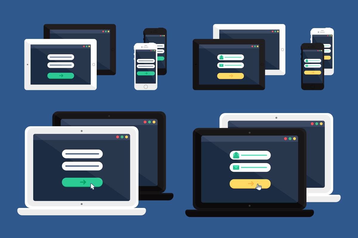
The phrase “responsive design” describes creating a website whose layout changes depending on the viewing environment. In other words, a responsive website will appear and operate differently on various gadgets, including desktop computers, tablets, and mobile phones.
The key to responsive design is to utilize HTML and CSS media queries to alter the website’s design, dependent on screen width. One website might have three separate structures: one for desktop computers, one for tablets, and one for mobile phones. The website may automatically determine the device’s width by utilizing media queries and loading the appropriate layout.
A responsive grid is the most popular method for building a responsive website out of a few other ones that can be employed. A responsive grid is a grid of components that automatically adapts to the screen’s width. Each of the containers that make up the grid has a specific width. The containers adjust to fit the new width when the screen size changes.
Although several responsive grid systems are available, the Bootstrap grid system is the most often used. Using the Bootstrap grid framework, a 12-column grid can be used to develop responsive webpages.
Utilizing responsive pictures is another typical responsive design method. Images that automatically adjust their size to fit the screen’s width are said to be responsive. The attribute on the tag can be used to do this.
For various screen sizes, you can specify multiple pictures using the Element. You might use different images for desktop computers, tablets, and mobile devices. The browser can automatically choose the ideal image for the device by utilizing the attribute.
There are several methods for ensuring that your website is responsive. Utilizing a responsive grid structure and responsive pictures is crucial. However, a few other techniques can be applied to enhance your website’s responsiveness.
Utilizing media queries to load multiple CSS stylesheets for various screen sizes is a standard strategy. It enables you to alter your website’s appearance based on
Developing Flexibility for Multiple Devices
Creating a website that can be viewed and utilized on any device, regardless of its capabilities or screen size, is what we mean when we talk about making it adaptable for various devices. This practice is frequently referred to as “progressive enhancement.”
A website viewed on several devices can be made in a few different ways. Utilizing responsive design is one option. It implies that the layout of your website will automatically change to fit the screen size of the browser window. If you want your website to look fantastic on all devices, this is a great alternative, but it can be more challenging to set up.
Utilizing multiple versions of your website for various gadgets is another method for making an adaptable website. It means that whenever a user tries to access your website on a mobile device, you should direct them to the website you created exclusively for mobile devices. It can be an innovative solution if you want to ensure that your main website looks the same across all platforms or if you’re going to provide a unique mobile-specific experience.
Regardless of your strategy, ensuring everyone can access and use your website, irrespective of their device, is crucial.
Approaching Accessibility First
A web development style known as the 11 accessibility first approach prioritizes the demands of users with impairments. The phrase “universal design” is another name for it.
This strategy is based on the notion that by making your website accessible to everyone, you will also improve its overall usability and effectiveness. It is because websites that are accessible have a clean layout and are simple to use.
There are numerous methods for making a website accessible. The most typical ones are utilizing transparent and concise language, providing transcripts for audio and video content, and adding alt text to images.
Why is it essential to use the 11 Accessibility First Approach?
The importance of the 11 accessibility first strategy can be attributed to various factors.
It is right to do it, first and foremost. Online resources and information should be accessible to all equally.
Second, websites that are accessible are typically easier for everyone to use. It is because they are frequently well-structured and straightforward to utilize.
Third, expand the audience you can target by making your website accessible. It is because over 1 billion individuals globally have a handicap. Your website can reach this sizable market if it is accessible.
Finally, websites that are accessible often have better search engine optimization. It is so because popular search engines like Google favor websites that are user-friendly for everyone.
How Can I Create an Accessible Website?
You can do a lot of things to make your website accessible. Among the most typical are:
By including alt text, you can make it easier for people with vision problems to understand what is on the website.
Transcripts for audio and video content are helpful for people who are hard of hearing or deaf to comprehend what you’re saying.
Using clear and simple language will help users with cognitive disabilities grasp your material.
Making your website responsive will enable people with physical disabilities to use it on various devices.
By testing your website, you can ensure it is user-friendly for everyone.
Designing with Inclusiveness for All Users
We must consider every user’s demands as the web expands and changes. It covers individuals with special needs, those with sluggish internet connections, and those using various devices. Making sure that all users can access and use our websites is not only morally right but also beneficial to businesses.
We guarantee that all users can access our websites in several ways. Utilizing gradual improvement is one option. This method adds a website’s fundamental functionality over time as demand dictates. By doing this, even users who cannot use the site’s more sophisticated capabilities can still access the site’s basic information and features.
Utilizing responsive design is another technique to guarantee inclusive design. A website may adjust to multiple devices’ screen sizes and resolutions. The website and its information may still be accessed by people using various devices, which is a crucial fact.
Finally, testing your website across various devices and browsers is critical. It will enable you to find any potential accessibility problems and address them before the site goes live.
In the current digital environment, it is crucial to make sure your website is inclusive and accessible to all people. Your website will be accessible to everyone using responsive design and progressive improvement.
In certain cultures, the number 13 is thought to be unlucky. However, there are some cultures where the number 13 is seen as lucky.
The number 13 is frequently seen to be unlucky in Western culture. The number 13 is linked to misfortune, death, and the devil. The 13th hour of the day, regarded as the most disastrous hour, is also connected to the number 13.
The number thirteen is seen as lucky in China. It is so because the Chinese Zodiac sign of the dragon is linked to the number 13. The dragon represents strength, power, and good fortune.
The number thirteen is seen as lucky in Japan. It is so because the number 13 is linked to the snake, representing the Japanese zodiac sign. The snake represents longevity, intelligence, and good fortune. Therefore, depending on where you are from, you may believe the number 13 to be lucky or unlucky.