
A Conceptual Overview
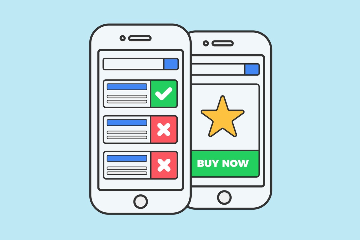
A web design strategy known as “mobile-first design” puts the needs of users of mobile devices first. It indicates that when designing and constructing a website, consideration should be paid to mobile devices. It contrasts the conventional strategy known as desktop-first design, which begins with a desktop version of a website and then adapts it for mobile devices.
As the number of individuals utilizing mobile devices to access the internet has increased tremendously in recent years, the mobile-first strategy has surged in popularity. By 2022, 4.77 billion people are expected to be using mobile internet globally, according to Statista. It is a considerable growth compared to 2019, when there were 3.8 billion mobile internet users.
The mobile-first approach is gaining traction for a variety of reasons. The ability of businesses to improve the user experience for their mobile visitors is one of the most crucial factors. It’s critical to ensure your website is optimized for mobile devices as these gadgets gain popularity.
The fact that mobile-first design can enhance your search engine optimization (SEO) is another factor contributing to its growing popularity. According to Google, they are pursuing a mobile-first index, meaning they would base their search results on websites’ mobile versions. As a result, if your website isn’t mobile-friendly, you can lose out on many prospective visitors.
Consider using a mobile-first strategy if you’re considering rebuilding your website or creating a new one. In this post, we’ll examine what mobile-first design is and some of the advantages of applying it.
How does mobile-first design work?
As we already discussed, mobile-first design is a method of web design that puts the needs of users of mobile devices first. It indicates that when designing and constructing a website, consideration should be paid to mobile devices.
Starting with a mobile-friendly website is one of the critical components of mobile-first design. It is different from the conventional strategy of beginning with a desktop.
Meeting User Expectations: The Value of Mobile Optimization
We are all aware of how prevalent mobile devices are becoming and how many people use them to access the internet. As a result, it is crucial now more than ever to ensure your website is mobile-friendly.
The importance of mobile optimization can be attributed to a variety of factors. One of the most crucial benefits is that it makes sure your website lives up to user expectations.
Users now anticipate websites to be mobile-friendly. In other words, people expect them to be simple to operate and explore on a mobile device. If your website is not responsive to mobile devices, users may become annoyed and give up on using it.
Raising your website’s search engine rating is another crucial benefit of mobile SEO. Search engines now factor in a website’s mobile friendliness when determining its ranking. As a result, your website is likely to appear lower in search results if it is not optimized for mobile devices.
Finally, mobile optimization is crucial because it can raise your website’s conversion rate. More users are likely to complete the intended activity, such as making a purchase, signing up for a newsletter, or filling out a form, if your website is simple to use and navigate on a mobile device.
As you can see, many factors contribute to the significance of mobile optimization. You must ensure that your website is mobile device optimized if you want it to be successful.
Responsive vs Mobile First Design: Selecting the Appropriate Method
There are a few essential considerations when deciding between responsive and mobile-first designs. Before choosing a choice, it’s critical to comprehend how the two differ because each strategy has distinct advantages that can improve the usability of your website.
A web design known as responsive design ensures that web pages display correctly across various devices, including desktop computers and mobile phones. With this “one size fits all” method, any size screen may access your website.
A different strategy is “mobile-first design,” which begins with developing for mobile devices before scaling to larger screen sizes. This strategy is gaining popularity as more individuals access the internet via mobile devices.
Which strategy is best for you, then? It all relies on your wants and objectives. Responsive design is the way to go if you want your website to be available to as many people as possible. Nevertheless, mobile-first design is the superior option to optimize your website exclusively for mobile devices.
Whatever strategy you decide on, remember that the most crucial step is to build with your consumers in mind. You’ll be sure to design a website they’ll adore if you keep their demands and goals at the center of your decision-making process.
Best Practices and Considerations for Small Screen Design
The globe is becoming more mobile, which is no secret. According to estimates, more than 6.1 billion smartphone users will be worldwide by 2025. For businesses to succeed in this vast and expanding market, their websites must be mobile-friendly. But precisely what does that mean?
There are various approaches to mobile-friendly design, but “mobile-first” is the most successful. Designing for mobile devices first and then adapting that design for larger screens is known as mobile-first design. This strategy works so well because it compels you to concentrate on the most crucial functionality and content, which is essential to users of small displays.
A few recommended practices and things to consider while creating a mobile-first website exist.
-
Keep things simple.
Keeping it simple is one of the most crucial considerations when designing for small screens. It entails maintaining words and pictures to a minimum and ensuring your material is simple to scan and understand. Users of mobile devices frequently seek out quick solutions, so it’s crucial to make sure they can quickly and easily find what they’re looking for.
-
Give content and functionality a top priority
Content and functionality are important factors to consider while designing for mobile. It would help if you were deliberate about the content and functionality you offer when designing for small screens. Every component on the page ought to have a function and aid the user in achieving their objectives. It implies that certain features or content that isn’t necessary may need to be removed.
-
Make use of big, tappable buttons
Using big, simple-to-tap buttons is another excellent design practice for mobile-first environments. It is crucial since people who use mobile devices frequently have smaller hands and fingers, making it challenging to press tiny buttons precisely. By employing extensive controls, you may lessen customer annoyance and ensure they can easily browse your website.
-
Create with touch
Finally, consider touch when designing small screens. It should only take a few hints to traverse your website.

Streamlining Mobile Device Navigation: Improving User-Friendliness
Over 80 times a day, the average person checks their phone.
Many users rely on their mobile devices for more complicated operations like online shopping or banking, even though most interactions are simple, like checking the time or responding to a text.
The navigation on mobile devices must be well-designed and user-friendly for these activities to run smoothly.
There are a few crucial techniques for streamlining mobile device navigation, which can eventually improve the user experience.
-
Use a hamburger menu.
A three-bar icon known as a “hamburger menu” is frequently used on mobile devices to represent a menu. It’s an easy and efficient approach to fit more navigation on a small screen and into a drop-down list for a website.
-
Limit yourself to one column.
The user’s needs must be considered when designing for mobile. One way to do this is a single-column layout, which is simpler to scan and navigate on a small screen.
-
Use iconography.
A mobile navigation menu can be made more visually appealing and compact using icons. They can indicate a button’s or link’s functioning without additional text.
-
Be dependable.
It’s crucial to keep your mobile navigation menu’s design consistent. It entails maintaining a compatible hues, fonts, and design elements palette. For your visitors, this will provide a unified and straightforward experience.
-
Test repeatedly.
Testing your mobile navigation menu before launching it is crucial, just like with any other design. It will enable you to identify potential problems and guarantee simplicity. Test it on a few different gadgets to understand how it appears and feels on various screen sizes.
Make a mobile navigation menu that is simple and visually appealing by using the advice in this paragraph.
Readability and Legibility on Smaller Screens with MobileFirst Typography
We are all aware that mobile technology has revolutionized society. Research suggests that mobile devices account for over 60% of all internet traffic. As a result, you must ensure that your website or app looks attractive and is simple to use on smaller screens if you want it to be successful.
Typography is one of the most crucial components of mobile-first design. Your user experience can be made or broken by how your text appears on a smaller screen. Users are likely to quit and go on to something else if their writing needs to be more significant or more challenging to read.
You can take a few steps to ensure your font is clear and readable on smaller displays. Use a large font size first. Although it may seem apparent, remember that mobile consumers frequently view your site on a smaller screen. They shouldn’t need to zoom in to read your material.
Use a sans serif font next. Sans serif fonts are more straightforward to read on a screen than serif fonts. It is due to the difficulty of reading the series—the little lines that finish each letter—on a small screen.
Utilize a high contrast ratio, third. Using a light font color on a dark backdrop or a dark font color on a light background is what this means. Your content will stand out and be simpler to read as a result.
Use line spacing to finish. The gap between each line of text is this. Your writing can be simplified by leaving more space between the lines.
By adhering to these suggestions, ensure your font is readable and legible on smaller displays. For your mobile visitors, this will offer a better user experience.
Image and Media Optimization for Mobile: Juggling Performance and Quality
We all know mobile devices‘ processing, storage, and bandwidth capabilities are constrained. We must take extra care when optimizing photos and other forms of material for mobile.
While balancing quality and performance while optimizing photos and media for mobile, there are two critical considerations.
-
Keeping performance and quality in check
The balance between quality and performance should be given priority. On the one hand, ensure your material and graphics display well on mobile devices. On the other hand, you want to use manageable amounts of bandwidth or make them manageable enough to forfeit performance.
You can do a few things to strike the appropriate balance, including:
– To reduce file size without compromising quality, use image compression.
– When using visuals, try to use vectors. Compared to raster images, vector graphics are more compact and practical.
– Use video compression to cut down on bandwidth and file size.
– Use responsive design to adjust images and other media to mobile device screen resolutions and sizes.
-
Performance image and media optimization
You must balance quality and performance while ensuring your images and media are suitable for mobile viewing.
You can perform the following things to make your photos and media more mobile-friendly:
Utilize the appropriate file format. Use JPEG for images, for instance, and PNG for graphics.
– Resize pictures and other media to fit the screen of a mobile device.
– Distribute media files and images over a content delivery network (CDN). By caching content closer to the user, CDNs can contribute to performance improvement.
Remember these points to ensure your images and media are optimized for mobile devices. It will enhance the functionality of your website and give users a better user experience.
Creating Intuitive Mobile Experiences Through Touch-Friendly Interactions
Mobile devices require designers and developers to consider a variety of touch-friendly interactions that provide users with a natural user experience. After all, mobile devices like smartphones and tablets are made to be operated by touching them.
Three main touch-friendly interactions are required to develop intuitive mobile experiences:
-
Swipe
Swiping is one of the most popular touch-friendly interactions. This gesture is frequently employed when scrolling across the material, switching between displays, or navigating within an app. Users can quickly and easily retrieve the content they want by swiping, a simple interaction.
-
Tapped
Another typical touch-friendly interaction is tapping, which is used to select things, activate menus, or start applications. Users may quickly and easily engage with their mobile devices by tapping.
-
Clamping
The pinch is a touch-friendly interaction to zoom in or out of stuff. A user-friendly method for getting a closer look at visuals or text is pinching.
For the creation of user-friendly mobile experiences, these three touch-friendly interactions are necessary. Your users will have a seamless and delightful experience if you incorporate these interactions into your mobile design.
Streamlining Input and Increasing Conversions with Mobile First Forms
One of the most crucial components of any mobile app is its mobile forms. They are utilized for several functions, including data entry. But creating a movable shape can be difficult. There are several things to consider, including the screen size, the way the user enters data, and the data entry areas.
Here are four suggestions for streamlining mobile forms and enhancing conversions:
-
Use a single-column layout as a starter.
The use of a single-column layout is crucial when creating mobile forms. Users will find it simpler to enter data on a small screen. Users will only have to enter data into one field at a time, lowering the possibility of errors.
-
Make field labels brief and descriptive.
Use concise and evocative field labels whenever possible. Users will find it easier to fill out each field if they know what information to include. Additionally, it will make it simpler for them to complete the form.
-
Utilize placeholder text
Using placeholder text is another excellent approach to making mobile forms easier. Users can get what information they need to provide from the text shown in each field. For lengthy and complicated structures, placeholder text is constructive.
-
Use Auto-Fill
Use auto-fill if your form requests that users enter sensitive data, like a credit card number. The user’s info will be automatically filled in thanks to this function. They will save time and experience fewer mistakes as a result.
These pointers will help you streamline mobile forms and boost conversion rates. Any mobile app needs to have mobile forms. Thus, it’s critical to do them right.
Mobile Performance Optimization: Shortening Load Times
Performance-wise, mobile devices are frequently the weakest link. However, there are techniques for accelerating load times and enhancing performance on mobile devices.
Five suggestions are provided below to help you make the most of your mobile website or app:
-
Using a content delivery network (CDN).
A CDN can enhance performance by delivering material from a server closer to the user’s location. It can speed up page loads and cut down on latency.
-
Image optimization.
A significant factor in sluggish page loads can be imagined. To ensure quicker loading times, make sure to optimize your photographs. It includes employing the appropriate file format, picture compression, and a responsive image solution.
-
Cut down on HTTP requests.
The browser sends several HTTP requests to load all the resources on a page each time a user accesses it. It may accumulate and lengthen loading times. CSS sprites and inline images are two methods you can use to reduce the number of HTTP requests.
-
Utilize caching.
Caching can increase performance by storing frequently used files and resources locally on the user’s device. It can speed up page loads and lower latency, especially on sluggish or unstable connections.
-
JavaScript optimization.
Although JavaScript is a vital tool, it may also be a significant factor in delayed website loads. JavaScript can be made more efficient by minifying, compressing, and loading JavaScript files asynchronously.