
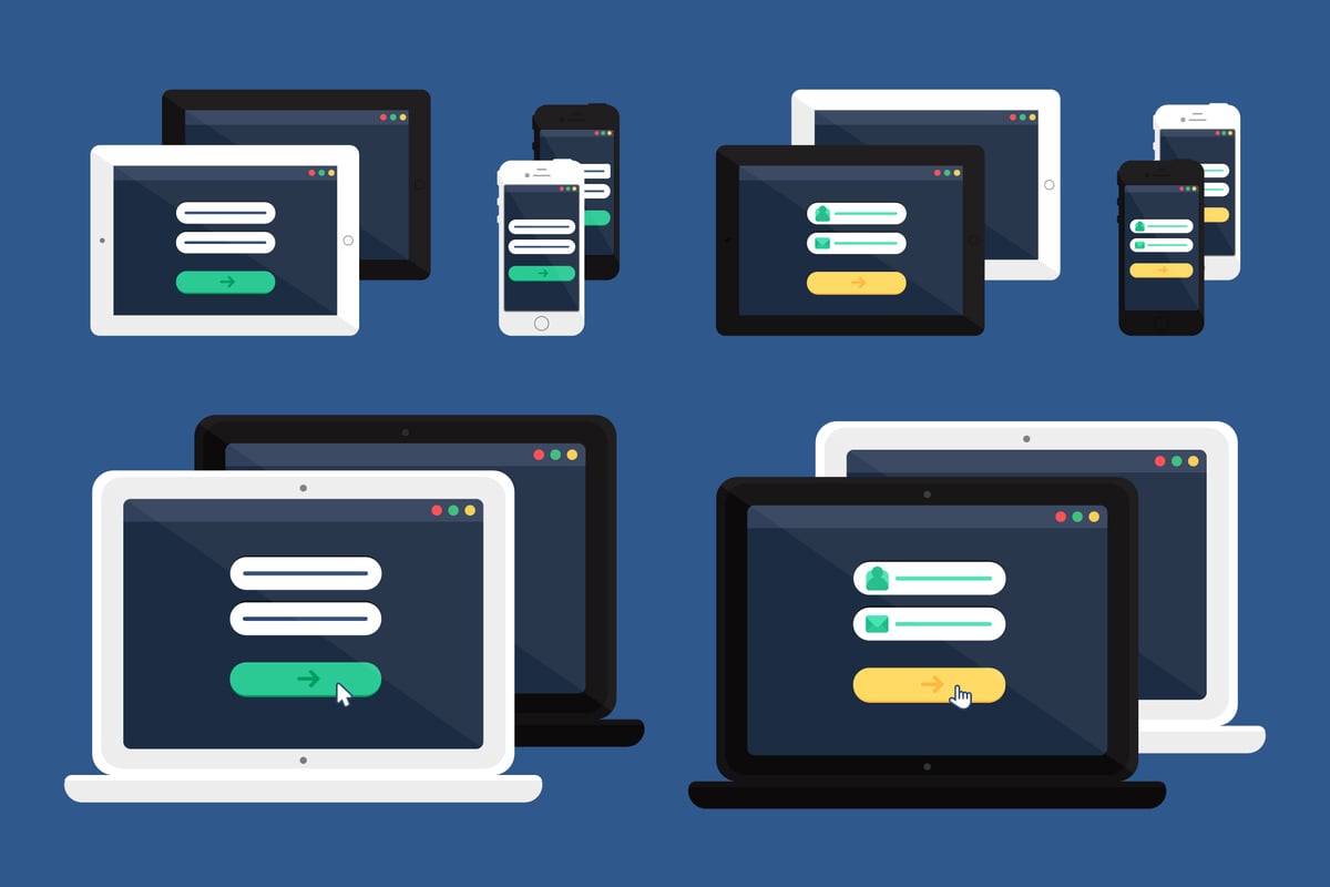
Adaptive design: what is it?
The adaptive design aims to provide user experiences tailored to the particular devices and screen sizes people use to access them. It means that designers create many versions of their plans, each optimized to perform well in a specific type of device, rather than just one design meant to operate well on all devices.
The following are a few significant advantages of applying an adaptive design strategy:
- Better user experience: You can make the design considerably more user-friendly by adapting it to the device users’ access. It is because consumers can use their device’s features, like touch screens and various screen sizes, which can enhance their enjoyment of using your website or app.
- Enhanced engagement: Users are more likely to stick around and refer your website or app to others if they had a good time using it. It may result in more users visiting and using your website or app.
- More adaptability: Using an adaptive design strategy, you can easily modify your design to consider newly available devices and screen sizes. It enables you to easily change your plan to take advantage of new technologies, which can be a massive advantage in the swiftly evolving world of today.
In general, using adaptive design is a terrific way to create user interfaces tailored to the devices consumers use to access them. Adaptive design is something you should consider if you want to enhance the user experience of your website or app.
The advantages of websites with flexible design.
Website design in the early days of the Internet was a one-size-fits-all endeavor. Websites were created to be seen on desktop computers with wide screens and quick internet connections. It was acceptable at the beginning when desktop users in industrialized nations accounted for most internet users.
However, since the Internet has gained popularity, individuals have used it in various settings and contexts. People have a wide range of internet speeds and use several devices, including laptops, tablets, and smartphones, to access the Internet. Because of this, building websites that function correctly for everyone has become challenging for web designers.
A method of designing websites that considers the various ways users interact with the Internet is known as adaptive design. The goal of adaptive design is to build websites that function well across a range of platforms and environmental factors. There are several advantages to this strategy.
-
Extended range
A larger audience can be reached using adaptive design. You may make your website accessible to users in various circumstances by designing for some devices and internet speeds. It is crucial, especially in poorer nations where internet speeds are slower and mobile device usage is more prevalent.
-
A better user interface
A better user experience is achieved through adaptive design. A website can utilize a device’s features when explicitly made for that device. The website may become simpler to use and more entertaining to interact with.
-
Boosted sales
An improved user experience may result in higher sales. People are more inclined to buy from you if they enjoy utilizing your website. Additionally, adaptive design can make it simpler for customers to use mobile devices to buy your goods or services.
-
Lower development expenses
Long-term financial savings are possible with adaptive design. You can design and develop a single website that can be accessed on various devices rather than creating and developing many versions of your website. Significant cost reductions may result from this.
-
More adaptability
A more adaptable method of website design is adaptive design. Being independent of a particular device or screen size
Important adaptable design ideas.
Scalability, modularity, and adaptability are the three central tenets of adaptable design. These guidelines enable developers to make websites and software easily reconfigurable for various screen sizes and gadgets.
Flexibility is crucial because it enables designers to produce layouts that are simple to modify to accommodate various screen sizes. Thanks to modularity, designers can divide their ideas into smaller parts that can be reorganized or changed for multiple screen sizes. By scaling, designers may quickly scale up or down their designs to accommodate various screen sizes.
Designers can build websites and applications that are responsive to the demands of their consumers by adhering to these guidelines.
Using adaptive design methods to make your website responsive.
As we are all aware, the use of mobile devices to access the Internet has increased significantly over the past few years. Mobile devices, including tablets, have surpassed desktop computers as the preferred method of web browsing, according to Stat Counter.
There has been a significant change in how people use the Internet, providing a substantial issue for website owners. Since most websites are made primarily for desktop computers, mobile users frequently need a better user experience.
One solution to this issue is utilizing responsive design strategies to help your website adjust automatically to various screen sizes. However, older devices with slower processors and smaller screens have better options than this.
A better alternative is to construct a distinct version of your website just for mobile devices using adaptive design methods. In this manner, you can improve the user experience for your mobile users by designing and functionally optimizing for the smaller screen size.
One of the most successful methods is employing a “responsive web design.” It combines fluid pictures, media queries, and flexible layouts to build a website that automatically adapts to various screen sizes.
Let’s examine this process in more detail.
Adaptable Layouts
Creating a flexible layout is the first stage in establishing a responsive web design. It calls for a flexible grid structure that instantly adapts to various screen sizes.
Using a responsive grid system, such as the one offered by Bootstrap, is one of the most well-liked ways to accomplish this. This grid’s 12-column arrangement, which can be readily broken into smaller or bigger sections as needed, serves as its Foundation.
Media Requests
Media queries are a crucial component of responsive web design. A CSS3 feature called media queries enables you to adjust your website’s styles according to the screen size.
For instance, you could use a media query to hide specific items on tiny devices or modify the font size of your headlines on small screens.
Making use of recommended techniques and methods for adaptive design.
Ethan Marcotte initially used the term “adaptive design” in a 2010 piece on A List Apart. A design strategy is “flexible and fluid, sizing itself to the viewport and dynamically rearranging itself to present the best possible layout for the available screen space.” Put another way, it’s a method of making your website seem fantastic on any device, regardless of size or quality.
Although various adaptive design methods exist, responsive design is one of the most well-liked. This method makes a website look fantastic on any screen by combining fluid grids, adaptable pictures, and media queries.
You should follow some best practices and methods if you want to integrate the adaptive design on your website.
-
Utilize a fluid grid
Using a fluid grid is one of the critical components of responsive design. Instead of using predetermined pixel values, this grid is based on percentages. The screen size enables the grid to enlarge or reduce as necessary.
-
Employ adaptable imagery
The use of adaptable pictures is a crucial component of responsive design. It calls for the benefit of images that are also fluid—that is, able to enlarge or reduce as necessary. It is crucial because it guarantees that the photos will always fit inside the container regardless of the screen size.
-
Utilize media queries
An essential tool for responsive design is media queries. You can use them to target particular styles to particular screen sizes. It is crucial because you can now develop one method that works well on all devices rather than making numerous designs for different screen sizes.
-
Consider the information
It’s crucial to consider the content when creating a responsive website. It entails producing simple material to read and use across all platforms. Utilizing succinct, short words and clear titles is one method.
-
Test repeatedly
Testing your website on all devices after you’ve applied responsive design is crucial. This

Case Studies: How Websites Were Transformed by Adaptive Design
Creating a website that functions effectively across various devices and looks beautiful doing it can be challenging. However, with adaptive design, building a website that works and looks fantastic on every device, including desktop computers and smartphones, is feasible.
We’ll examine adaptable design in this article to see how it can change a website. We’ll also look at some cases where adaptive design has enhanced website user experience.
Adaptive Design: What is it?
A website can adjust to the device it is being viewed on thanks to a web design style called adaptive design. It means that whether seen on a desktop computer, a tablet, or a smartphone, the website will appear excellent and function correctly.
Combining responsive design and device-specific design results in adaptive design. A style of web design called responsive design makes a website seem excellent on all devices. A flexible grid system that adapts to the size of the screen is used to achieve this. A web design style known as device-specific design employs various layouts for various devices. It implies that while the website’s prominent appearance and feel will be the same, it will appear differently on a desktop computer than on a smartphone.
How Websites Changed Due to Adaptive Design
The way websites are created and evolved has changed due to adaptive design. Websites were made first for desktop computers, then mobile devices. It meant that a website’s mobile version was frequently a subpar rendition of the desktop version.
Websites are created specifically for mobile devices using adaptable design. It indicates a significant improvement in the mobile user experience. The material is simple to read and browse, and the layout is tailored for the smaller screen.
Case Studies in Adaptive Design
More and more businesses are utilizing adaptive design to enhance the user experience on their websites. Here are several instances when websites have benefited from the usage of adaptive design:
First Starbucks
One of the biggest coffee chains in the world, Starbucks also has one of the most well-liked websites.
Overcoming Obstacles in Adaptive Web Design Adoption
There is a variety of approaches to site design. Consider the various screen sizes and resolutions your users would use to access your site to design a successful website. Adaptive design can help with this.
With the help of adaptive design, you can make a single website that works well on all devices regardless of screen size or quality.
However, implementing an adaptive design for your website may help. We’ll look at some of the issues you might encounter in this blog article and how to deal with them.
-
Finding the appropriate balance
Finding the ideal balance between offering an excellent user experience to all people and ensuring that your website still looks fantastic and performs properly on all devices may be one of the obstacles you encounter while implementing an adaptive design.
Trying to cram as much content and functionality into your website as possible can be tempting, but this sometimes results in a cluttered and perplexing design that is challenging to use on mobile devices.
Instead, concentrate on offering the fundamental data and features your users require and ensure it is easy to access and use across all platforms.
-
Making sure your website loads promptly
Ensuring that your website loads swiftly on all devices may be another problem you need help with. It can be tempting to attempt to load multiple versions of your website for each, given the wide range of screen sizes and resolutions that must be considered.
However, since your website must load numerous copies of the same material, this frequently results in poor loading times.
Instead, concentrate on performance optimization to ensure your website loads swiftly on all devices. Reducing the size of your photos, utilizing a content delivery network (CDN), and minifying your CSS and JavaScript files are all ways to do this.
-
Verifying your website across all platforms
Testing your website on all devices may be your last obstacle. Trying your website on every available screen size and resolution can be challenging.
Resources and Tools for Applying Adaptive Design
As we all know, design is a crucial component of any website or application. The user experience can be made or broken by it. Additionally, designers must keep up with the most recent technologies and trends, given the rapidly evolving nature of technology.
“Adaptive design” is one of the newest buzzwords in the design industry. A responsive design strategy called adaptive design produces various iterations of a website or application depending on the size of the user’s screen. It is the case as opposed to conventional responsive design, which generates a single version of a site that adapts to various screen sizes.
There are several approaches to putting adaptable design into practice. This blog post will cover three of the most well-liked tools and resources for doing this.
-
Bootstrap
A front-end framework called Bootstrap aids designers in building responsive websites and applications. A grid system, pre-made components, and unique CSS styling are all included. One of the most well-liked tools for adaptive design is Bootstrap, which has a vast community of designers and developers who contribute to its code base and is simple to use.
-
The basis
Another prominent front-end framework for responsive and adaptive design is Foundation. It has a grid structure, premade UI components, and Sass support for personalized style. Bootstrap is simpler than Foundation, yet Foundation is more adaptable. For seasoned designers who desire more control over their designs, this makes it a fantastic option.
3.Adaptive.js
A JavaScript package called adaptive.js aids developers in building responsive webpages and programs. It has several features, such as a grid system and media query breakpoints. Compared to Foundation and Bootstrap, Adaptive.js is both more versatile and sophisticated. Because of this, it’s a fantastic option for designers who desire total control over their creations.
These three technologies are all excellent for developing websites and applications that are responsive and adaptable. Selecting the one that is best for your project is critical because each has unique strengths and drawbacks.
Have you ever worked with adaptive design? Comment below and let us know!
What to Expect from Future Trends in Adaptive Design
Adaptive Design: What is it?
The adaptive design aims to build websites that can change to fit the many screen sizes and devices people may use to access them. Users can browse the website on whichever device they use without problems. As a result, it improves the user experience.
What are the 4 Adaptive Design Future Trends?
-
More frequently utilizing responsive design
An adaptive design known as responsive design enables websites to automatically change their content and layout to fit the many screen sizes and devices that users may use to access. As more and more people access the Internet via several different machines, this tendency will likely persist.
-
Greater attention to user experience
An improved user experience will be prioritized as adaptive design becomes popular. It means that when developing websites, designers must pay more attention to usability and accessibility.
-
More HTML5 and CSS3 usage
The most recent versions of the HTML and CSS standards are HTML5 and CSS3. These guidelines increase flexibility and enhance how well webpages display and work across various devices. We anticipate seeing more websites utilizing these technologies in the future.
-
Using mobile-first design more frequently
A web design strategy known as “mobile-first design” prioritizes building websites first for mobile devices before expanding them to larger screens. This trend is expected to persist as more individuals use mobile devices to access the Internet.
Measuring Success with Adaptive Design: Monitoring Performance and User Experience
Any design approach aims to produce a product that satisfies user needs. In terms of web design, this entails developing a website that is simple to use, has a positive user experience, and is available on various gadgets.
Monitoring the performance of the website and the user experience is one approach to gauging how well a design works. Several tools, including Google Analytics, heat maps, and user testing, can be used for this.
A free service called Google Analytics offers comprehensive data on website traffic. It comprises details regarding the number of visitors, the pages they view, their length of stay, and their source of origin. The site’s design can be enhanced with the help of this data.
Another tool for monitoring performance is heat maps. They demonstrate where users click, how far they scroll down, and what they view. The positioning of content and calls to action can be improved using this information.
User testing allows you to see firsthand how visitors to a website behave. In-person testing or a service like UserTesting.com can be used for this. Designers can identify areas that require improvement by testing how people interact with the website.
A design strategy known as “adaptive design” accounts for the various screen sizes and devices consumers will use to visit a website. It entails making a design that appears excellent on a desktop computer, a tablet, and a phone.
There are several methods for doing this. One is to design a website with a responsive layout that adapts to the screen size using CSS media queries. A different mobile site tailored for small displays is an alternative strategy.
The needs of your project will determine which strategy you employ. Regardless of your approach, monitoring performance and user satisfaction is crucial for gauging success.

