
What are media queries, and why are they crucial?
A CSS3 module named media queries enables you to style your HTML document differently depending on factors like the viewport’s width, the type of device used, or the orientation. They are an effective technique for producing responsive designs and are relatively simple.
Understanding that media queries are intended to be utilized as a component of responsive design is crucial. They should therefore be used to aid in the creation of structures that appear excellent on a range of gadgets and screen sizes.
One advantage of using media queries is avoiding making different stylesheets for various devices. It can be a significant advantage when working with a large website that must be compatible with multiple devices.
Employing media queries to build more accessible designs is another advantage of using them. Media queries, for instance, can be used to make designs that are simpler to read on smaller devices.
Media queries are a robust technique that may be utilized to make responsive designs. They are relatively simple and can save you from building different stylesheets for various devices. Consider implementing media queries if you’re trying to make a responsive design.
Establishing breakpoints: Select the widths your media queries should target.
Choosing what widths to target in your media queries is one of the most crucial decisions regarding responsive design. The media queries will determine how your site appears and functions across various devices.
You can choose what widths to target using a few different strategies. Targeting the most significant devices to your audience is the most crucial step.
One strategy is to focus on the most widely used devices. It ensures that your website appears excellent on the gadgets your target market uses the most.
Another strategy is to focus on particular device widths. It is advantageous to have a specific design for a particular device width.
Lastly, you can also aim for particular breakpoints. When you create a website, it will appear well at specific widths. It is helpful if you want to develop certain layouts for various device widths or if you want your site to look well on all devices.
Whatever strategy you choose, test your site on all the devices you intend to use. By doing this, you can ensure that your website functions and seems how you want it to.
The mobile-first strategy: Why it’s crucial to begin small and build upon that.
Following the mobile-first method requires starting small and building from there. By starting with the smallest screen, you can ensure your material is available to all users, regardless of their device. Instead of starting from scratch, you can add additional features and capabilities by building up from there.
The mobile-first approach is crucial because it helps ensure your site is available to all users regardless of their device. You can provide open content to everyone by beginning small and building up from there. In the modern world, when there are so many various kinds of gadgets that people use to access the internet, this is highly crucial.
The mobile-first strategy is crucial because it enables you to concentrate on the most critical material. Making sure that the stuff you include is vital by first beginning with the smallest screen. It can guarantee that your site loads quickly and help make it more user-friendly.
In general, using the mobile-first strategy is crucial to building a website that is user-friendly for everyone and concentrates on the most vital information. You can ensure your site is accessible to everyone and contains the most critical content for your consumers by beginning small and building up from there.
Desktop optimization: Using larger screens to their fullest potential.
It’s critical to optimize your website or app for various screen sizes as screens get bigger and bigger. You may adjust the CSS for different screen sizes by utilizing media queries, ensuring your website or app looks great on every device.
Here are some pointers for making your website or app more user-friendly on more giant screens:
- Modify the CSS for various screen widths using media queries.
- Check that your material can be viewed easily on larger screens.
- Make use of films and images that are big enough to fill larger screens.
- Ensure your app or website is simple on larger screens.
- Tablet-friendly layouts: Things to consider while modifying your design for medium-sized devices.
There is no one-size-fits-all when it comes to responsive design. It would be best to consider various screen densities and screen sizes. On a low-density screen, a format that looks fantastic on a high-density one could appear fuzzy.
Designing for tablets is a fantastic method to solve both of these problems. Develop a great layout on all devices by preparing specifically for medium-sized screens.
When modifying your layout for medium-sized screens, keep the following in mind:
-
Make font sizes more extraordinary.
Reading writing that is too small on a small screen can be challenging. However, larger font sizes are considerably simpler to read on a medium-sized screen. Ensure that your text sizes are big enough to read on a tablet.
-
Widen the distance between the elements.
The spacing between items is crucial for legibility, just as font sizes. On a small screen, it can be challenging to tell between things that are too near to one another. Your design will be more tablet-friendly if you give the elements more room to breathe.
-
Add more blank space.
Your best friend when it comes to tablet-friendly design is whitespace. Increase the amount of whitespace in your plan to improve readability and navigation.
-
Make your design simpler.
On a small screen, a complicated design can be challenging to browse. Simplify your plan to make it more user-friendly when modifying your layout for medium-sized screens.
-
Use photos with caution.
Images can enhance your design, but they can also work against it. Images on a small screen can be challenging to view. They can occupy too much space on a medium-sized screen and make your design appear cluttered. Make sure photos are optimized for medium-sized displays and only sometimes use them.
These pointers help you design a layout that is both tablet-friendly and responsive.
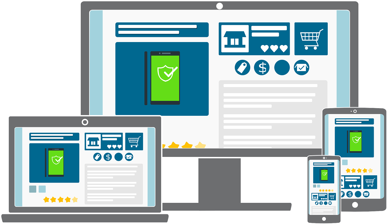
Introduction to responsive images
Images that are responsive scale to suit the screen size used to see them. It implies that a responsive image will be smaller when viewed on a small mobile device than on a large desktop computer.
Why is it importance of responsive images?
Because they improve user experience, responsive graphics are crucial. Responsive pictures ensure that images are always clear and straightforward to see by adapting to the size of the screen. It is essential for mobile devices since people frequently examine photos on tiny screens.
How do responsive pictures function?
Media queries are how responsive pictures function. With the help of the CSS technique known as media queries, you may style your page differently depending on the screen size. Media queries determine the screen’s width while serving responsive images, and the right picture is delivered.
What advantages can responsive images offer?
Using responsive photos has a lot of advantages.
By offering crisp, easy-to-read images on all devices, responsive photos enhance user experience.
Responsive images reduce the time pages load by just supplying the right picture for the device.
By lowering the number of pointless image downloads, responsive images can help you save money on bandwidth expenditures.
What problems do responsive images have?
Using responsive pictures has certain disadvantages.
The creation and maintenance of responsive images can be more challenging.
On smaller devices, responsive pictures can occasionally produce images of inferior quality.
What are the ideal methods for producing responsive images?
When using responsive photos, there are a few guidelines to remember.
To give your photographs many size possibilities, always use the I attribute.
To assist the browser in choosing the right image, be sure to provide the sizes property.
Use the picture element to give users more choice over which image is displayed.
Test them frequently to ensure your responsive photos operate as intended on all devices.
The blogs that are related to it are listed below.
How scalable and ideal responsive images ensure display
As we know, Responsive pictures are images that can be resized to fit inside a container. They are an excellent way to guarantee that your website will appear fantastic on all platforms, including small and large screens.
However, you may also employ responsive images to make your website scalable. It implies that the photos on your website will still appear beautiful if you add more content.
Utilizing responsive image breakpoints is one method for doing this. By doing this, you provide a range of image sizes that will be used for various screen sizes.
For instance, a small image for mobile devices, a medium image for tablets, and a vast image for desktop PCs.
Utilizing versatile image sizes is another technique to ensure your website is scalable. As a result, the image will be automatically resized to fit the available screen space.
It is an attractive option if you want to avoid setting breakpoints.
There are numerous additional techniques to guarantee the scalability of your website. These two approaches are the most popular, though.
A fantastic method to guarantee that your website looks its best is to use responsive pictures. However, they are also an excellent technique to ensure the scalability of your website.
It is significant since it indicates that your website can manage additional content without malfunctioning.
Support for high-resolution graphics on retina displays
The iPad Air 2 and iPhone 6 Plus are head and shoulders above the competition regarding resolution. They have the most effective solutions of any iOS device and a display type known as a “retina” display. The human eye cannot resolve each pixel because they are so small and closely spaced.
As a result, the pictures and text are incredibly sharp and look beautiful regardless of how near you hold the smartphone to your face. Additionally, Apple can fit more pixels into the same amount of space since the pixels are so small. The iPad Air 2 has a little lesser 264 ppi than the iPhone 6 Plus, which has a staggering 401 pixels per inch (ppi).
There is a cost associated with all of this high-resolution bliss. For your program to look normal, its graphics must be twice as detailed as those on a non-retina device. Additionally, you’ll need to include even higher-resolution pictures if you want your app to appear its best on a retina display.
Thankfully, producing different visuals for retina and non-retina screens is unnecessary. You can figure out what kind of device your app is running on and then offer up the proper graphics thanks to a little thing called media queries.
Here’s an easy illustration:
-webkit-min-device-pixel-ratio: 2, @media only screen
merely a screen and a minimum device pixel ratio of two {
Retina-specific CSS should be included here.
}
Only devices with retina displays, such as the iPad Air 2 or iPhone 6 Plus, will be matched by this media query. Therefore, only retina devices will get your high-resolution graphics’ CSS if placed inside this media query.
Of course, you should also offer low-resolution graphics for devices without retina displays. Use an alternative media query, such as this one, to accomplish that:
-webkit-min-device-pixel and @media only screen
Adapting techniques to variations in orientation
As we know, mobile devices exist in various designs and sizes. As a result, we plan for our information to be shown in both portrait and landscape mode when developing websites and mobile applications.
Utilizing media queries to change our content’s styles based on the device’s orientation is one method to deal with this. We’ll look at media queries in this tutorial to see how to utilize them to change the styles of our content for both portrait and landscape orientation.
Let’s first examine how to determine a device’s orientation. Utilizing the window is the simplest method for doing this. Property of orientation. The value returned by this attribute indicates the direction of the device. The device is in portrait orientation if the value is 0. The device is in landscape orientation if the value is 180.
We can use media queries to modify the styles of our content depending on the orientation of the device now that we understand how to detect the direction of a machine. For instance, we may use a media query to guarantee that our content will always be presented in full-screen mode when the device is in landscape orientation.
@media screen and (landscape orientation)
body in HTML
width: 100%;
tallness: 100%;
}
}
We can use media queries to change the layout of our content and the styles of our content. For instance, using a media query, we may alter how our content is presented when the device is in a portrait position.
(Portrait orientation) @media screen
the content
width: 100%;
not float;
}
}
As you can see, utilizing media queries to modify our content’s styles and layout for various orientations is an easy and efficient approach to guarantee that it always displays appropriately on all devices.

