Adaptive design defines the modern web by delivering faster, contextual, and personalized digital experiences across devices. Learn how adaptive design works, why it matters in 2025, and how it outperforms traditional responsive design.
What Is Adaptive Design?
Adaptive design defines the modern web by going beyond simple screen resizing. Instead of stretching one layout across every device, adaptive design creates intentional, tailored, context-aware experiences.
While responsive design reacts, adaptive design anticipates—adjusting layouts, functionality, and content based on device capabilities, network performance, user behavior, and environmental context.
-
What Is Adaptive Design? (Focus Keyword)
-
From Responsive to Adaptive: The Shift Toward Intelligent Experiences
-
The Core Philosophy Behind Adaptive Design
-
How Adaptive Design Works
-
Why Adaptive Design Defines the Modern Web in 2025
-
UK & USA Case Studies in Adaptive Innovation
-
Adaptive Design vs. Responsive Design (Strategic Comparison)
-
Conclusion: The Future Belongs to Adaptive Experiences
In the ever-evolving landscape of digital experience, design no longer lives in pixels alone — it breathes, reacts, and adapts. As screens multiply and contexts diversify, brands are reimagining what it means to be truly accessible, intelligent, and responsive.
Yet, the web has entered a new chapter. The era of simple “responsive design” — where one layout fluidly resizes to fit multiple devices — is giving way to something far more strategic and sophisticated: adaptive design.
If responsive design taught us flexibility, adaptive design teaches us intentionality. It’s not merely about resizing; it’s about rethinking — crafting digital experiences that anticipate needs, honor context, and elevate performance.
This article explores why adaptive design is no longer a design trend, but a revolution redefining the modern web — a blend of human empathy and machine intelligence that shapes how businesses, brands, and users interact in the age of digital diversity.
1. The Shift: From Fluid Screens to Intelligent Experiences
When responsive design first emerged in the early 2010s, it was revolutionary. It allowed a single website to dynamically adjust to various screen sizes — mobile, tablet, or desktop — without building separate versions. This breakthrough aligned with the mobile boom, ensuring usability and visual harmony across devices.
But technology, like its users, evolved. Today, the digital environment is not just multi-screen — it’s multi-dimensional. Users interact with brands through smart TVs, in-car dashboards, wearable devices, AR interfaces, and voice assistants.
In this complex ecosystem, “one-size-fits-all” is no longer enough. What we need is a design philosophy that doesn’t just respond — it anticipates. That’s where adaptive design comes in.
While responsive design reacts to screen size, adaptive design responds to context. It serves custom layouts, optimized assets, and tailored functionality depending on device capabilities, connection strength, user preferences, and behavioral patterns.
Think of it this way:
Responsive design is a chameleon — flexible, yes, but uniform.
Adaptive design is a conductor — orchestrating unique experiences for every instrument in the orchestra of devices.
2. The Core Philosophy: Design with Purpose, Not Reaction
At its heart, adaptive design is not about aesthetics; it’s about experience intelligence.
It’s the design equivalent of bespoke tailoring — crafting a digital suit that fits every device perfectly, down to the last pixel.
Where responsive design focuses on fluid grids and flexible images, adaptive design introduces an additional layer: decision-making. It uses conditional logic and device detection to deliver specific layouts and interactions for different contexts.
For instance:
- A fintech dashboard on a tablet might prioritize data visualization and touch gestures.
- The desktop version could offer expanded analytics and keyboard shortcuts.
- A smartwatch interface may display only essential notifications.
In adaptive design, every interface variation is strategically planned, not automatically generated. It’s responsive design with precision engineering — where creativity meets cognitive design thinking.
3. The Mechanics of Adaptivity: How It Works
Behind its seamless elegance, adaptive design is powered by a robust technical framework.
a. Breakpoints and Device Detection
Unlike responsive design’s fluid layout approach, adaptive systems rely on predefined breakpoints — specific widths or device types that trigger different design templates. These templates aren’t simply resized; they’re restructured for the optimal experience.
Server-side technologies can detect user agents, network speed, device type, and even location, allowing content and features to adapt dynamically.
b. RESS (Responsive + Server Side)
A hybrid model, RESS combines the flexibility of responsive design with server-side intelligence. This means content and layout decisions can occur before the page loads, ensuring faster rendering and improved performance — a crucial advantage for mobile networks.
c. AI and Personalization
Emerging adaptive systems integrate machine learning models that learn from user behavior. They adapt not only to device specifications but also to user preferences and historical patterns — shaping truly personalized web experiences.
In essence, adaptive design turns static code into living architecture — intelligent enough to transform itself according to real-world context.
4. Why Adaptive Design Matters in 2025

As the web becomes more fragmented and users expect seamless, frictionless interactions across all platforms, adaptive design offers the clarity and control that responsive frameworks cannot.
Performance Efficiency
Adaptive sites load only what’s needed for a specific device. This results in faster load times, lower bounce rates, and enhanced SEO — all critical to digital competitiveness.
Contextual Relevance
Each version of an adaptive site is tailored for use-case and environment. For example:
- A healthcare portal might simplify the UI for patients accessing it on mobile devices.
- A SaaS dashboard might load advanced analytics only for desktops.
Accessibility and Inclusion
Adaptive design allows for custom accessibility layers — such as larger fonts, voice navigation, or simplified layouts — based on user profiles or assistive technologies.
Brand Consistency Across Complexity
By creating design systems that adapt intelligently, brands maintain visual and emotional consistency while delivering contextually optimized experiences.
In 2025 and beyond, adaptive design will be the cornerstone of user-first innovation — merging UX empathy, data intelligence, and system flexibility into one cohesive practice.
5. UK and USA: Case Studies in Adaptive Excellence
Both the UK and USA have become powerhouses of adaptive design innovation — each with a distinct philosophy that mirrors their digital cultures.
United Kingdom: Heritage Meets Precision
- Fintech Platforms (London): Firms like Revolut and Monzo employ adaptive interfaces that alter dashboard density and interaction speed depending on the user’s device, ensuring seamless trading on mobile or desktop.
- Government Services (GOV.UK): Adaptive frameworks help maintain accessibility compliance and usability across legacy devices, a critical factor for public inclusivity.
- Luxury E-Commerce (Burberry, Harrods): UK brands use adaptive content delivery to serve high-resolution imagery for desktops and optimized assets for mobile — balancing opulence with efficiency.
United States: Innovation Meets Intelligence
- SaaS Enterprises (Salesforce, HubSpot): Adaptive design empowers them to offer feature-rich dashboards on large screens while simplifying onboarding interfaces for smaller ones.
- Healthcare Platforms (Mayo Clinic, Zocdoc): Their adaptive systems tailor patient experiences based on device type, location, and accessibility needs.
- Media and Tech Giants (Apple, Netflix): These companies leverage adaptive streaming and interface scaling to deliver frictionless, platform-specific engagement.
Across both markets, the message is clear: adaptive design is no longer an experiment — it’s an expectation.
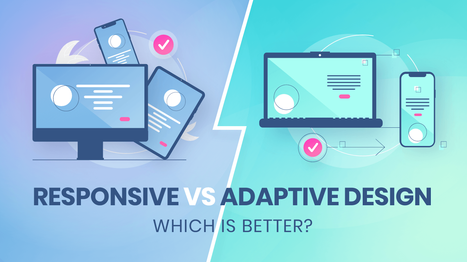
6. Adaptive Design vs. Responsive Design: The Strategic Divide

To understand adaptive design’s superiority, it’s crucial to distinguish philosophy from functionality.
| Feature | Responsive Design | Adaptive Design |
| Core Principle | Fluid layouts adjust automatically | Predefined layouts adapt intentionally |
| Device Handling | Same design for all devices | Different designs for different devices |
| Performance | May load unnecessary assets | Loads optimized assets per device |
| Control | Limited control over user context | Full control and customization |
| Development Complexity | Easier to implement | Requires more planning and testing |
| Experience Outcome | Consistent | Personalized and optimized |