Learn how AI-Enabled Automation Platforms are transforming the next decade of responsive web design. Discover future-proof strategies, adaptive UX, AI-driven layouts, and intelligent design systems for 2030 and beyond.
-
Introduction: AI-Enabled Automation Platforms and the Future of Responsive Web Design
-
Part I — The Past: Foundations of Responsiveness
2.1 Media Queries
2.2 Flexbox
2.3 CSS Grid -
Part II — The Present: Responsive Design Matures
3.1 Container Queries
3.2 Fluid Typography & Grids
3.3 Performance-Responsive Design
3.4 Accessibility as Core Responsiveness -
Part III — The Future: Responsive Intelligence
4.1 AI-Driven Adaptive Layouts
4.2 Voice-Responsive UX
4.3 Context-Aware Personalization
4.4 Cross-Device Continuity -
Part IV — Building Future-Proof Responsive Systems
5.1 Design Tokens
5.2 Progressive Enhancement
5.3 Automation & AI Consistency
5.4 Ethics & Privacy -
Conclusion
-
Summary
-
Internal & External Resources
How AI-Enabled Automation Platforms Will Future-Proof Responsive Web Design for the Next Decade
Introduction: A Decade of Screens, Devices, and Disruption
AI-Enabled Automation Platforms are reshaping how we design responsive digital experiences. When responsive web design (RWD) emerged in 2010, its goal was simple: ensure layouts adapt to different screens. But today, the web extends across watches, TVs, cars, AR glasses, VR headsets, and voice-first devices.
The next decade demands more than responsive layouts — it requires responsive intelligence.
This guide explores how RWD has evolved and how AI-Enabled Automation Platforms will future-proof digital experiences for 2025–2035.
Introduction: A Decade of Screens, Devices, and Disruption
Responsive Web Design (RWD) was born from necessity — a solution to the chaos of screen diversity.
When Ethan Marcotte coined the term in 2010, the idea was revolutionary: create fluid grids and flexible media that adapt seamlessly to any device.
Fifteen years later, RWD has evolved far beyond resizing elements. The web is no longer just viewed on desktops, tablets, and phones — it’s experienced through watches, TVs, voice assistants, car dashboards, and even augmented-reality glasses.
The next decade won’t just demand responsive layouts — it will require responsive intelligence.
This article traces the past, present, and future of responsive design — exploring how developers, designers, and organizations can future-proof their digital experiences for the devices, interfaces, and users of 2030.
Part I: The Past — Foundations of Responsiveness
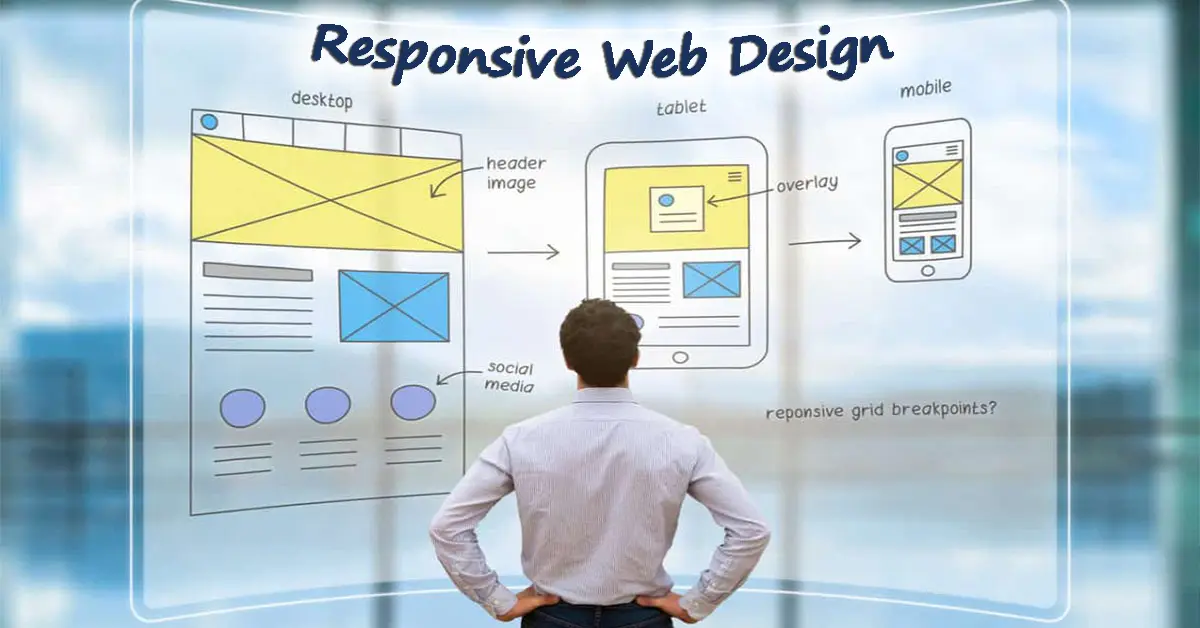
The web’s early years were dominated by static layouts — rigid, pixel-locked designs that assumed users had identical screens. But the mobile revolution shattered that illusion. Responsive design emerged as the solution to an expanding device ecosystem.
1.1 The Era of Media Queries
Media queries were the bedrock of RWD. They allowed CSS to react to screen width, orientation, and resolution, giving designers control over fluid breakpoints.
A simple rule like:
@media (max-width: 768px) {
.container { width: 90%; }
}
transformed how developers thought about adaptability.
However, as devices multiplied — foldables, 4K monitors, embedded browsers — the approach became strained. Developers realized that device width alone could not capture the complexity of user environments.
1.2 Flexbox: The Layout Revolution
Then came Flexbox — a game-changer that redefined layout logic.
Instead of relying on floats and clears, Flexbox introduced flexible containers that aligned, justified, and resized automatically.
It gave developers dynamic control, simplifying grid creation and vertical alignment — something nearly impossible before.
Yet, Flexbox was still one-dimensional — powerful for linear flows, but less optimal for large-scale grid systems.
1.3 The Rise of CSS Grid
CSS Grid arrived to complete the puzzle — offering true two-dimensional control. Designers could finally map elements spatially, creating complex, magazine-like layouts that remained flexible and semantic.
By 2020, Grid + Flexbox became the gold standard for responsiveness.
The modern web was now dynamic, modular, and fluid — but it still lacked awareness.
Websites responded to devices, not contexts.
Part II: The Present — Responsive Design Matures
The 2020s brought a new phase of sophistication. Developers began thinking beyond fixed breakpoints — aiming to create fluid, component-driven, and contextually intelligent systems.
2.1 Container Queries: The End of Fixed Breakpoints
Container queries represent one of the most important shifts in modern web design.
Instead of relying on viewport width, components now adapt to their parent container.
For example:
@container (min-width: 500px) {
.card { flex-direction: row; }
}
This means a card, button, or menu can adjust automatically based on where it lives — not the overall screen size.
The result: truly modular design systems, where responsiveness is baked into every component rather than dictated globally.
2.2 Fluid Grids and Scalable Typography
Modern web design embraces fluidity instead of rigid thresholds.
Techniques like the clamp() CSS function allow responsive scaling that transitions smoothly between values.
Example:
font-size: clamp(1rem, 2vw + 0.5rem, 2rem);
This single line creates typography that feels natural — growing and shrinking intelligently without predefined breakpoints.
Fluid design reflects a broader truth: the future of responsiveness is continuous, not conditional.
2.3 Performance-Responsive Design
Today’s users expect instant response — regardless of device or connection.
A modern responsive strategy must therefore consider performance as a design dimension.
Techniques include:
- Adaptive image loading: Serving WebP or AVIF depending on device capability.
- Lazy loading: Rendering only what’s visible.
- Resource prioritization: Using preload and prefetch intelligently.
Responsive design is no longer just visual; it’s operational — optimizing what loads and when.
2.4 Accessibility as Core Responsiveness
Accessibility has evolved from compliance to core design philosophy.
Responsiveness now extends to user diversity — not just screen size.
Designers build interfaces that adapt to motion preferences, color contrast needs, and assistive technologies.
True responsiveness means every user experiences the web at their best, regardless of ability or context.
Part III: The Future — Responsive Intelligence (2025–2035)

As we approach 2030, responsive design is entering a new dimension — driven by AI, voice, and adaptive personalization.
The focus shifts from device adaptation to user adaptation.
3.1 AI-Driven Adaptive Layouts
Imagine a website that doesn’t just respond to your screen, but to you.
In the near future, AI layout engines will dynamically adjust content hierarchy based on user behavior, location, and intent.
For example:
- A frequent user sees quick actions first.
- A first-time visitor gets a guided onboarding layout.
- A mobile user on slow data gets a lightweight version automatically.
Tools like Figma’s AI auto-layout and adaptive CSS frameworks are early hints of this evolution.
By 2030, AI-assisted responsive systems will continuously reflow layouts, resize assets, and re-prioritize content — autonomously optimizing experience in real time.
3.2 Voice-Responsive UX
With the rise of voice interfaces — from Siri to Alexa to in-car assistants — the web must evolve beyond the screen.
Voice-responsive design will enable applications to respond contextually to speech, adapting both visually and functionally.
Example:
- A voice command could rearrange the dashboard layout.
- Accessibility tools could shift font contrast when voice-narration begins.
- Web apps could blend voice and visual responses into synchronized experiences.
In the next decade, responsive design will mean multimodal design — responsive to touch, voice, and even gesture.
3.3 Context-Aware Personalization
The ultimate goal of future-proof responsiveness is context awareness — design that reacts dynamically to the environment, not just interface.
Emerging technologies like:
- Ambient sensors (light, temperature, motion)
- Device APIs (battery, network strength, orientation)
- User preference learning
…will allow web experiences to morph intelligently.
A site might switch to high-contrast mode in bright sunlight or defer animations when the battery is low.
This kind of “environmental empathy” will define the next generation of the web — interfaces that adapt like living organisms.
3.4 The Role of Cross-Device Continuity
By 2030, users will no longer browse the web on a device — they’ll exist within a continuum of devices.
A shopping cart started on a watch could be completed via AR glasses.
A dashboard viewed on desktop could instantly translate into voice-only mode in a car.
Developers must prepare for this cross-device state persistence — where responsiveness includes not just screen resizing but context migration.
APIs such as Web Share, Service Workers, and Web Bluetooth will become foundational to maintaining continuity across the user journey.
Part IV: Building Future-Proof Responsive Systems

How can organizations start designing today for a 2030 web?
The answer lies in combining technical adaptability with strategic foresight.
4.1 Adopt Design Tokens and System Thinking
Design tokens — color, spacing, typography, motion — abstract visual properties into reusable variables.
They act as a universal language between design and code.
By using tokens with CSS custom properties or tools like Style Dictionary, teams can make design systems inherently scalable and responsive.
4.2 Build with Progressive Enhancement
Future-proof systems gracefully degrade.
Every new feature — AI personalization, voice integration, sensor APIs — should layer on top of a solid, accessible foundation.
This ensures that even older browsers or restricted devices receive functional experiences.
4.3 Leverage Automation and AI for Consistency
AI design assistants can audit responsiveness, suggest optimal breakpoints, and test accessibility automatically.
In 2030, design pipelines will integrate continuous “AI QA” — bots ensuring fluidity across screens before deployment.
4.4 Prioritize Ethics and Privacy in Personalization
As responsiveness becomes more data-driven, privacy becomes critical.
Collect only what’s necessary. Let users opt into adaptive experiences.
The future of web design must balance intelligence with integrity.
Conclusion: The Shape of a Truly Responsive Future
Responsive Web Design began as a technical fix. It’s evolving into a design philosophy — a commitment to adaptability, inclusivity, and user-centric innovation.
The decade ahead will see RWD transform from device-driven layouts to intelligent, context-aware ecosystems powered by AI, voice, and environmental feedback.
In this new era:
- Layout becomes adaptive intelligence.
- Breakpoints become behavioral thresholds.
- Responsiveness becomes human awareness.
To future-proof your responsive strategy:
- Design systems, not pages.
- Think in tokens, not pixels.
- Build for users, not devices.
- And above all — design for change, not stability.
Because the only constant in web design is transformation — and the future belongs to those who code for evolution.
Summary
- Past: RWD began with media queries, Flexbox, and Grid — adapting layouts to screen sizes.
- Present: Container queries, fluid grids, and accessibility have redefined responsiveness as modular and inclusive.
- Future: AI-driven layouts, voice interfaces, and context-aware personalization will create responsive experiences that think and feel.
- Action: Build scalable design systems, adopt design tokens, and prepare for a world where responsiveness extends beyond the screen — into behavior, context, and intelligence.